Everyone reaches for bold script. Almost nobody uses small caps, and that is a shame, because small caps and superscript text solve a problem the loud styles cannot: making one part of a line different without making it louder.
Both are available in any Unicode generator, both come from blocks outside the mathematical range, and both have gaps in the alphabet that are worth knowing before you use them.
What small caps are for
Small capitals are capital letterforms drawn at roughly lowercase height. In books they mark the first line of a chapter, acronyms, and speaker names in plays.
They read as emphasis while keeping the line’s colour even. There are no ascenders spiking up and no descenders dropping down, so a small caps run sits as a solid, calm block in a way that neither uppercase nor bold manages.
On a social profile this makes them the best choice for section labels. A bio with three small caps labels and plain text between them looks organised rather than decorated, and it survives the small rendering sizes where script styles fall apart. It is also why they are the standard choice for Discord channel names, covered in the Discord field guide.
The gap in the small caps alphabet
Unicode has no small capital X. There simply is not one, because the set was assembled from phonetic notation rather than designed as a complete alphabet.
Most generators substitute a plain lowercase x, which is close enough to pass at reading size. It is worth knowing that the substitution is happening, because it means one letter in your label is not the same kind of character as its neighbours.
Small capital Q was added to Unicode late and is missing from some older fonts, so it occasionally renders as a box on Android even when the rest of the word is fine. If a label contains a Q and reliability matters, test it or rephrase.
What superscript is for
Superscript characters sit at the top of the line. They were built for footnote markers, ordinal endings and units: anything that annotates the text without joining it.
Used sparingly they are genuinely elegant. A small marker after a claim, a date suffix, a note number, a unit after a measurement. The eye registers them as secondary without stopping.
Used as a whole line they become unreadably small on a phone. Superscript characters are drawn at a fraction of the body size, and a phone screen has no resolution to spare for that.
What is missing there too
Superscript has no capital C, F, Q, S, X, Y or Z, and no lowercase q.
A good generator leaves those characters unchanged rather than substituting a look-alike, which is why a superscript word sometimes has one full size letter sitting in the middle of it. That is the honest behaviour. The alternative is text that silently lies about what it contains, and the moment you copy it somewhere else the substitution becomes obvious.
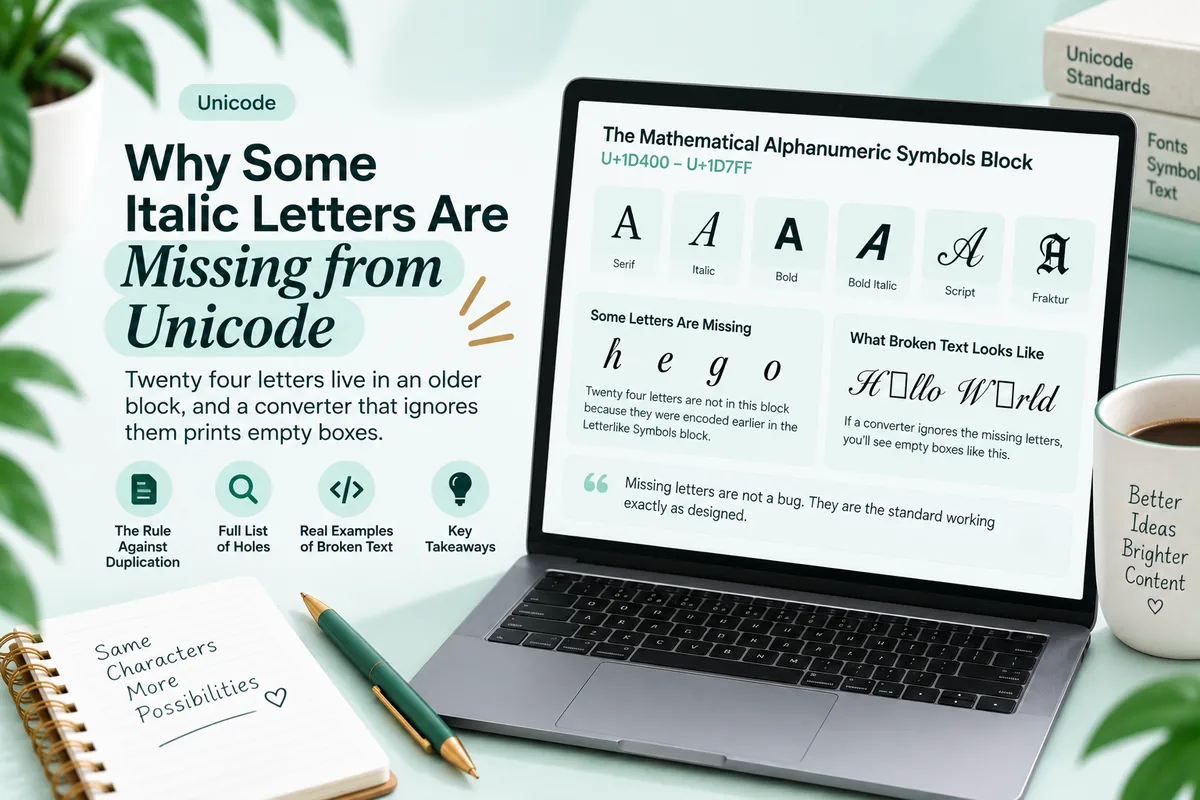
This is the same pattern as the twenty four missing letters in the mathematical block, described in why some italic letters are missing. Unicode assembled these sets for specific technical purposes, not as complete typographic alphabets, and the gaps are where those purposes ended.
Where each one belongs
| Use | Small caps | Superscript |
|---|---|---|
| Section label in a bio | Yes | No |
| Acronym inside a sentence | Yes | No |
| Footnote or note marker | No | Yes |
| Ordinal ending (1st, 2nd) | No | Yes |
| Unit after a number | No | Yes |
| Short category tag | Yes | No |
| A whole line of text | Only if short | Never |
| A keyword you want found | No | No |
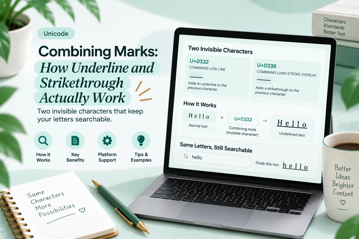
The last row applies to both, and it is the same rule that governs every substituted style. These are separate Unicode characters, so a search for the plain spelling will not match them. Use them for labels and annotations, never for the words someone might type. The mechanism is in does Unicode text hurt your SEO.
The combination worth stealing
Small caps label, plain sentence, superscript note.
It is a magazine layout compressed into three lines, and it works on every platform because none of the three elements depends on the platform providing anything. A worked example for a bio:
ᴡᴏʀᴋ Ceramics studio in Lahore. Wheel throwing classes. ᵒᵖᵉⁿ ᵀʰᵘʳˢ ᵗᵒ ˢᵘⁿ
The label organises, the plain line carries the searchable information, and the superscript line adds a detail without competing. Convert each part separately in the Italic Text Generator and paste them as separate lines.
Note the ˢ and ᵀ in that last line: superscript has no capital S, so a careful converter uses what exists and leaves the rest. Look closely at any superscript line before publishing it.
Subscript, and the rest of the quiet family
Superscript has a sibling that almost nobody uses, and a few relatives worth knowing about.
Subscript characters sit below the baseline. Unicode’s coverage here is much thinner than superscript: the digits are complete, but the letters cover only a handful of lowercase forms, mostly the ones chemistry and phonetics needed. There is no full subscript alphabet, so a subscript word will usually come back mostly unchanged. Use it for digits, which do work, and expect letters to fail.
Fullwidth letters come from a block designed for mixing Latin characters with Chinese, Japanese and Korean text, where every character occupies one square cell. Pasted into a Latin caption they produce wide, airy spacing. They are complete across letters and digits, which makes them unusually reliable, and their gaps come from font coverage rather than missing characters.
Circled and squared letters are the least reliable of everything in a generator. They live in Enclosed Alphanumerics and its supplement, and many symbol fonts skip those blocks entirely, so they are the styles most likely to appear as boxes. Circled letters also have an inconsistent history: the lowercase set was added long after the uppercase and digits, and some fonts still only cover part of it.
The pattern across all of these is the same one that governs small caps and superscript. Unicode assembled each set for a technical purpose, the set stops where that purpose stopped, and font coverage follows how useful the block was to the people who built the fonts. Decorative blocks come last in both.
Why these two age better than script
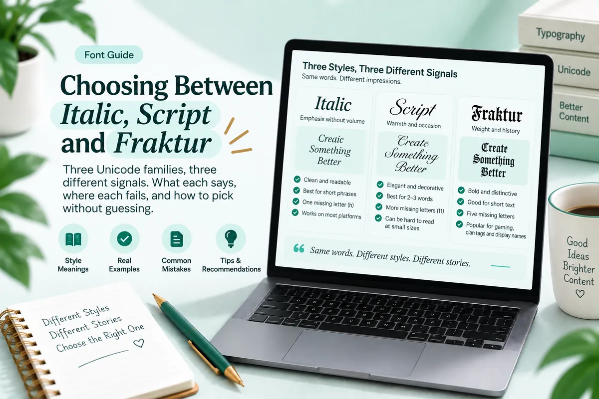
Script and fraktur date. They carry strong stylistic associations, they follow trends, and a profile styled heavily in cursive reads as a specific moment rather than as a design choice. The three families are compared in choosing between italic, script and fraktur.
Small caps and superscript are structural rather than decorative. They come from typesetting conventions that have been stable for centuries, which is why they read as considered rather than as an effect. A bio using them looks like it was laid out. A bio in bold script looks like it was styled.
They are also more legible at small sizes, which matters more than aesthetics on a phone. Small caps hold their shape in a Discord sidebar or an Instagram bio in a way that thin script does not.
Where they came from
Both sets exist for reasons that have nothing to do with design, which is why both are incomplete.
Small capital letterforms were encoded for the International Phonetic Alphabet and related phonetic notation, where a small capital represents a specific sound distinct from its lowercase counterpart. Phonetics needed the letters it needed, so the ones no notation used were never added, which is why there is no small capital X.
Superscript letters came from two directions: mathematical and scientific notation, and phonetic modifiers marking things like aspiration. Again, coverage stops where the notation stopped. There was no scientific convention requiring a superscript capital S, so there is not one.
Knowing this is useful beyond trivia. It tells you which gaps to expect: the missing characters are always the ones no technical notation needed, never the common ones, which is why these sets fail on unusual letters rather than everyday ones.
Try it
- Take a bio or a profile section that is currently one block of plain text.
- Convert two or three short words to small caps and use them as labels between the paragraphs.
- Leave every sentence underneath in ordinary letters.
- Add one superscript note at the end if there is a detail that deserves it.
- Check the result on a phone, and look specifically at any X, Q or capital S.
Step five catches the missing letters. It takes five seconds and prevents the one flaw that makes these styles look sloppy rather than deliberate.
Troubleshooting
One letter in a small caps word is the wrong size. Almost always the X. There is no small capital X in Unicode, so a lowercase x was substituted.
A small caps Q shows as a box. It was encoded late and some older fonts lack it. Rephrase or test on the devices that matter.
A superscript word has one full size letter. Superscript has no capital C, F, Q, S, X, Y or Z, and no lowercase q. The generator correctly left it alone.
Superscript is illegible on my phone. It is drawn at a fraction of body size by design. Use it for a few characters, never for a line.
A small caps label is not found by search. Expected. They are separate characters. Keep searchable words plain.
Questions people ask
What are small caps for? Section labels, acronyms and speaker names. They emphasise while keeping the line’s colour even.
Why is there no small capital X? It was never encoded. Generators substitute a lowercase x, which passes at reading size.
Which superscript letters are missing? Capitals C, F, Q, S, X, Y, Z and lowercase q.
Are small caps searchable? No. They are separate Unicode characters, so use them for labels rather than keywords.
When do I use superscript instead? When you are annotating rather than labelling: notes, ordinals and units.
The quiet option
These two styles do the job most people are actually trying to do when they reach for bold script, which is to give a line structure rather than volume. They are older, they are more legible at small sizes, and they hold up better over time. Learn where their alphabets stop, keep your keywords out of them, and they will do more for a profile than any decorative family.