Most people pick a styled font by scrolling until something looks nice. That works, but the three families in every generator carry very different signals, and picking by look alone is how a wedding caption ends up in blackletter.
Italic, script and fraktur are not three flavours of the same thing. They come from different traditions, they say different things, and they fail in different ways.
Italic: emphasis without volume
Italic is the quietest option. In typography it has always meant that a word is doing something slightly different: a title, a foreign term, a stressed syllable, an aside.
It does not shout. Used on one word in a caption it reads as care. Used on a whole paragraph it reads as an error, because a reader’s eye expects italic to end and return to upright.
Choose italic when your text is still a sentence and you want a reader to lean in rather than stop.
Practically it is also the safest of the three. Italic has one missing letter, the h, and good font coverage across every operating system.
Script: warmth and occasion
Script styles descend from copperplate handwriting. They signal celebration, personal attention and craft, which is why they dominate wedding, beauty and hospitality captions and why they look wrong on a technical announcement.
Script has real legibility limits and they are worse than people expect. The letterforms overlap, the strokes are thin, and at the size a phone renders a caption, more than a few words become a decorative texture rather than words. Two or three at most.
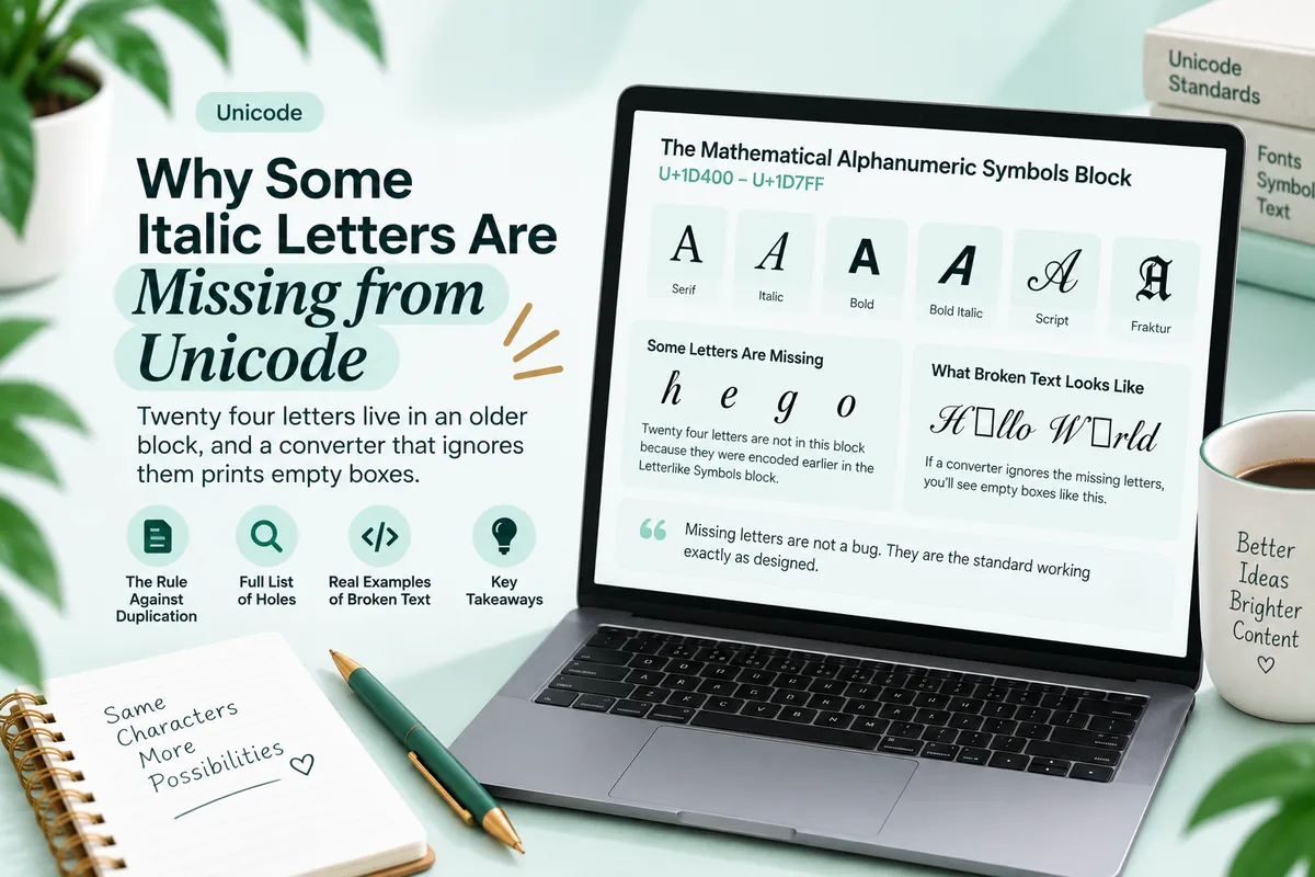
It is also the most technically fragile of the three. Script has eleven missing letters in the mathematical block, so a converter that skips the exceptions produces blank boxes across roughly a fifth of the alphabet. The full list is in why some italic letters are missing, and it is the reason broken script text is the most commonly seen failure in styled captions.
Fraktur: weight and history
Fraktur is a blackletter form. It carries associations with gothic subculture, metal, tattoo lettering and gaming clans, and for German readers in particular a heavier historical association that is worth being aware of before putting it on a public profile.
It has one clear practical advantage: it is dense and dark, so it holds up at small sizes where script disappears. That is why it is the standard choice for clan tags, role names and short display names, as covered in the Discord field guide.
Fraktur has five missing letters and generally good font coverage, so it sits between italic and script on reliability.
The three compared
| Italic | Script | Fraktur | |
|---|---|---|---|
| Signal | Quiet emphasis | Warmth, occasion | Weight, subculture |
| Readable length | A short sentence | Two or three words | Two or three words |
| Legibility at small size | Good | Poor | Good |
| Missing letters | 1 | 11 | 5 |
| Font coverage | Broad | Broad | Broad |
| Digits available | No | No | No |
| Best used for | An aside, a title | A sign off, a name | A tag, a display name |
| Worst used for | A whole caption | Anything informational | Anything neutral in tone |
The digits row applies to all three. None of the three families has encoded digits, so a number stays upright in the middle of a styled phrase whichever you choose. If a number has to look different, bold or monospace are the only families that include them.
Matching the style to what you are saying
A short decision procedure that works better than scrolling.
Is the text still a sentence? Use italic. It is the only one of the three designed to sit inside running text without breaking it.
Is it a name, a sign off, or a moment? Script, if it is warm. A studio name, a signature line, a two word closing.
Is it a tag, a handle or a label? Fraktur, if the tone is heavy. It survives small sizes and reads as deliberate.
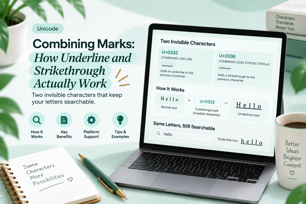
Is it information someone needs? None of the three. Keep it plain, because all three are separate Unicode characters that search cannot match and screen readers do not reliably announce. That constraint is covered in does Unicode text hurt your SEO and what screen readers really announce.
Where the loud choice is the wrong one
Two mismatches turn up constantly and both are avoidable.
Script on a technical or professional line. The style says handcrafted and personal; the content says specification. The clash reads as carelessness rather than warmth.
Fraktur on anything soft. Blackletter is heavy by construction, so a gentle phrase in fraktur reads as a joke even when it was not one. If the sentence is tender, script or italic carries it and fraktur fights it.
The third mismatch is subtler: any of the three on a long run. All three were designed as display or emphasis faces. None of them was designed to carry a paragraph, and Unicode versions are harder to read than real typefaces because the reader’s device is substituting a symbol font rather than a text face.
What each family looks like in the wild
Reading the descriptions is one thing. Recognising where each family has settled in practice is faster.
Italic turns up in captions that are still sentences: a book or film title, a quoted line, a single stressed word in an otherwise plain post. It is the only one of the three that appears regularly inside body text rather than as a label, because it is the only one designed to.
Script dominates profile sign offs and business names in a specific set of industries: weddings, beauty, florists, bakeries, photographers. That concentration is not an accident. Those businesses sell care and craft, and copperplate handwriting has signalled exactly that since long before Unicode existed.
Fraktur clusters in gaming handles, clan tags, metal and gothic adjacent accounts, and Discord role names. It is short form by nature: three or four characters carrying an identity, at a size where lighter styles vanish.
The mistake that makes styled text look amateur is using a family outside its territory without a reason. Script on a software update. Fraktur on a bakery. Italic stretched across a whole caption. Each of those reads as someone who picked by scrolling rather than by deciding.
There is one exception worth knowing. Deliberately mismatching a family to its content is a recognisable joke, and it works when the contrast is obviously intentional. A grocery list in blackletter is funny. A grocery list in blackletter with no other signal that it is a joke just looks like a mistake.
The pairing that always works
Plain body text, one styled element, plenty of space around it.
Whichever of the three you choose, the styled element only reads as deliberate when everything around it is ordinary. Two styled elements in one caption compete. Three read as a settings menu.
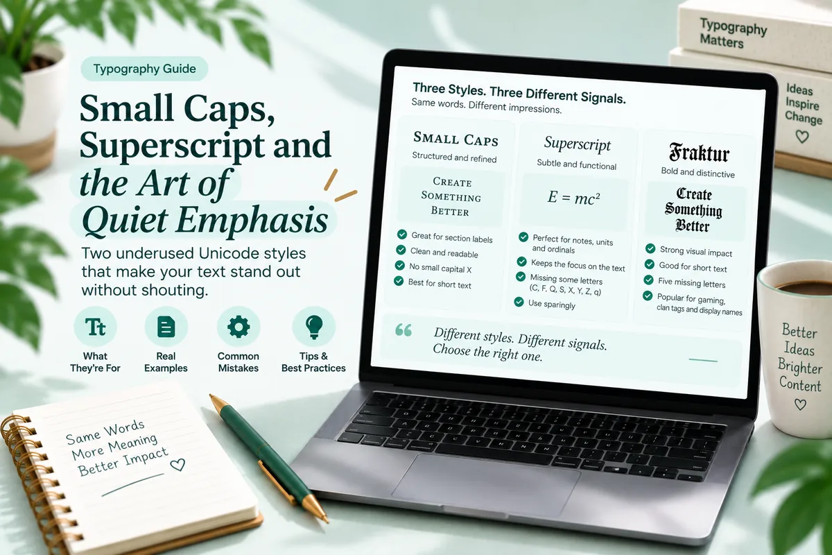
This is also why the quieter families are often the better answer. Small caps and superscript do structural work without the tonal commitment of script or fraktur, and they hold up better at small sizes. They are compared in small caps, superscript and the art of quiet emphasis.
What about the other families
The three in this guide are the ones people compare, but a generator offers several more, and two of them are often the better answer.
Sans serif italic is italic without the serifs. On a screen at small size that is frequently more legible than the serif version, because thin serifs are the first thing to disappear at low resolution. If serif italic looks fussy in your caption, try this before giving up on italic.
Bold italic carries more weight than italic while keeping the slant. It is the right choice when italic reads as too quiet against a busy background, which happens constantly over video thumbnails and photos.
Monospace is worth knowing about for a completely different reason: it is the only family here with digits, an even width, and a strong association with codes and references. If the thing you are styling contains numbers, monospace is often the only family that can style all of it.
Try all three on the same phrase
- Take one phrase you actually want to style, three or four words long.
- Convert it to italic, script and fraktur in the Italic Text Generator.
- Paste all three into a note on your phone, not on a desktop monitor.
- Read them at arm’s length, the distance people actually hold a phone.
- Note which one you can still read, and which one has become a shape.
Step four is the whole exercise. Script almost always wins on a monitor and loses at arm’s length, which is why it looks like the obvious choice while you are picking and the wrong one once it is published.
Troubleshooting
Script letters are blank. The converter skipped the eleven Letterlike Symbols exceptions. Try a different tool.
Fraktur looks thin rather than heavy. Your device fell back to a lighter symbol font. It will look different to other readers.
Numbers stayed upright. None of the three has digits. Use bold or monospace if the number matters.
A styled name is unreadable in notifications. Notification size is smaller than profile size. Fraktur and italic survive it; script rarely does.
The tone feels off and I cannot say why. Check the mismatch list above. It is usually script on technical content or fraktur on soft content.
Questions people ask
What is the difference between the three? Italic is quiet emphasis, script is warmth and occasion, fraktur is weight and subculture.
Which is most readable? Italic, clearly. Fraktur second. Script last, because thin overlapping strokes fail at phone sizes.
Which renders most reliably? Italic and fraktur. Script has coverage but eleven missing letters that careless tools break.
How many styled words at once? One phrase. Italic tolerates a short sentence, the other two do not.
Is fraktur associated with anything? Gothic, metal and gaming culture, plus a heavier historical association in German speaking contexts.
Picking without guessing
The three families are answering three different questions, so the useful move is to decide what you are saying before you decide how it looks. Sentence, use italic. Name or moment, use script and keep it to three words. Tag or label, use fraktur. Information anybody needs to find or hear, keep it plain and let the styling sit next to it rather than on top of it.