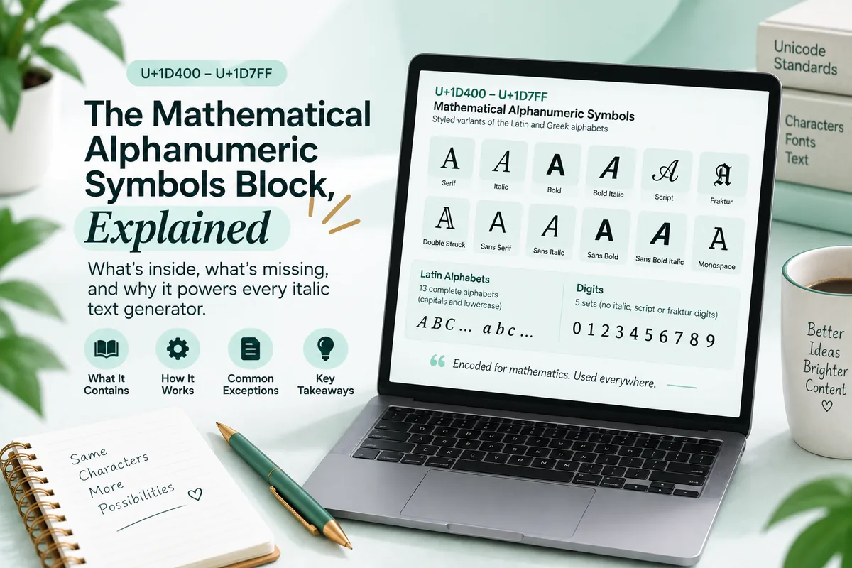
Convert the alphabet to italic and look carefully at one letter. Lowercase h does not come from the mathematical italic run at all. It comes from U+210E, the Planck constant, and it is the most visible sign of a decision Unicode made decades ago.
There are twenty four of these missing italic and styled letters, and they are not a bug. They are the standard working exactly as designed, which is why a converter has to know about every one of them by hand.
The rule against duplication
Unicode has a standing principle: never encode the same character twice.
When the Mathematical Alphanumeric Symbols block was drafted, a handful of italic, script, fraktur and double struck letters had already been encoded in the Letterlike Symbols block. They got there first because individual physicists and mathematicians needed them as symbols long before anyone proposed a complete styled alphabet. Planck’s constant, the Laplace transform, the set of real numbers, the script capital used for Fourier transforms: all of them were encoded as characters in their own right.
Rather than create duplicates when the full alphabets arrived, the committee left those slots permanently unassigned and pointed implementers at the existing characters.
The full list of holes
| Style | Missing capitals | Missing lowercase | Total |
|---|---|---|---|
| Italic | none | h | 1 |
| Script | B, E, F, H, I, L, M, R | e, g, o | 11 |
| Fraktur | C, H, I, R, Z | none | 5 |
| Double struck | C, H, N, P, Q, R, Z | none | 7 |
Twenty four exceptions across four styles. Every one of them has to be patched by hand in a converter’s mapping table, because arithmetic alone will land on an unassigned code point.
Script is the worst affected by a wide margin. Eleven holes out of fifty two letters means roughly a fifth of the script alphabet is not where the arithmetic says it should be, and script also happens to be one of the most popular styles, which is why broken script text is the version of this problem most people actually encounter.
What broken text looks like
A generator that ignores the holes emits unassigned code points. Your device has nothing to draw for an unassigned code point, so it shows a tofu box or a question mark.
The classic symptom is a script word where a handful of letters are blank, and the blanks are always from the list above. If you see a script phrase with gaps where the e and o should be, you are looking at a converter that did the arithmetic and skipped the exceptions.
This is different from the other reason styled text shows boxes. An unassigned code point is blank on every device in the world, because there is nothing to draw. A valid character with no font coverage is blank only on devices missing that font, and renders fine elsewhere. Both look identical to a reader. The distinction is covered in why italic text looks different on every device.
Why the borrowed letters look slightly off
Even when a converter gets it right, sharp eyed readers sometimes notice that one letter in a styled word sits a little differently from its neighbours.
That is real, and it has the same cause. The borrowed characters were designed for a different purpose, often years apart from the block that surrounds them, and they can carry different metrics: a slightly different width, a different sidebearing, a different optical weight.
Script capital R from Letterlike Symbols was drawn as a mathematical symbol, so it can sit a little differently from the script letters around it. It is correct, it is the character the standard tells you to use, it is just not from the same drawing session. Fonts vary in how carefully they harmonise the two sets.
The digits problem is separate
While counting what is missing, it is worth naming a different gap that catches people constantly.
Italic, script and fraktur have no digits at all. Not missing, not borrowed from elsewhere, simply never encoded, because mathematics had no convention requiring them. Only bold, double struck, sans serif, sans serif bold and monospace digits exist.
So a converter cannot produce an italic 7. The honest behaviour is to leave the digit upright, which is why a converted year or price looks unstyled in the middle of a styled phrase. A tool that produces a slanted digit is substituting from a different style without telling you. More on the block’s structure in the Mathematical Alphanumeric Symbols explainer.
How to check a generator in ten seconds
- Type
hello worldand convert it to script. Look at thee,lando. If any are blank, the tool does not handle exceptions. - Convert
hto italic on its own. It should be slanted. If it is upright, the U+210E substitution is missing. - Convert
RHINEto double struck. Four of those five letters are exceptions, so it is a fast stress test. - Convert
2026to italic. The digits should stay upright. - Paste the result into a plain text editor. What survives is characters; anything that vanishes was never a character.
Test three is the harshest and the most useful. Double struck has seven holes and most of them are common capitals.
The Italic Text Generator patches all twenty four by hand, and the coverage figures shown on that page are counted from the converter’s own mapping tables rather than typed in, so the numbers cannot drift away from what the tool actually does.
Why the gaps will never be filled
A reasonable question: Unicode has added tens of thousands of characters since 2001, so why not add the missing letters and make the arithmetic clean?
Because that would break the rule the gaps exist to protect. Encoding a second italic h would mean two characters that are the same character, which is exactly what Unicode’s stability policies forbid. Once a character is encoded its meaning cannot be changed and it cannot be removed, so a duplicate would be permanent and every system would have to handle both forever.
There is a second reason. Adding those code points would mean text encoded today and text encoded tomorrow would use different characters for the same letter, so a search for one would not match the other. The gaps are ugly, but they are stable, and stability is worth more than tidiness in a standard that everything else depends on.
The one exception people miss
There is a case that looks like an exception but is not, and it confuses people testing converters.
Double struck capital C, H, N, P, Q, R and Z are the seven that live in Letterlike Symbols, and they are also the seven that mathematicians use constantly: the complex numbers, the quaternions, the naturals, the primes, the rationals, the reals and the integers. That is not a coincidence. Those letters got encoded first precisely because they were in daily use as standalone symbols.
So the pattern behind all twenty four holes is the same. The missing letters are the useful ones. Script capital L was the Laplace transform, script capital F was the Fourier transform, italic h was Planck’s constant.
If you ever need to guess whether a particular styled letter is likely to be an exception, ask whether a physicist would have wanted it on its own. The answer is right more often than not.
What implementers are supposed to do
The standard is explicit about this, which is why the distinction between a careful converter and a careless one is not a matter of opinion.
The block’s documentation lists the unassigned slots and names the Letterlike Symbols character to use instead of each one. A conforming implementation looks up the exception table before applying the offset arithmetic. It is roughly twenty four lines of data.
That is the whole difference. A tool that emits blank boxes for script e is not dealing with a hard problem badly. It skipped a documented table because the arithmetic worked for most letters and nobody tested the rest.
What this means when you publish
Three practical consequences follow from the exceptions.
Test the exact phrase, not a sample. Whether a converter breaks depends on which letters your specific words contain. A tool that handles test perfectly can fail on hello.
Prefer well behaved styles for longer runs. Italic has one exception. Script has eleven. If a phrase has to render reliably, italic and sans serif italic are safer choices than cursive script.
A blank box is not always the reader’s fault. People assume boxes mean the reader’s device is old. Sometimes it means the text was generated badly, and no device anywhere will ever render it. Checking your own output before publishing separates the two.
Questions people ask
Why is the italic h different? There is no italic h in the mathematical block. The slot is unassigned and the correct character is U+210E, encoded years earlier as the Planck constant.
How many letters are missing? Twenty four: one italic, eleven script, five fraktur and seven double struck.
Why does my script text have blank squares? The converter emitted unassigned code points rather than substituting the Letterlike Symbols characters.
Which script letters are missing? Capitals B, E, F, H, I, L, M, R and lowercase e, g, o.
How do I test a generator?
Convert hello world to script. Blank letters mean the exceptions are not handled.
The takeaway
The gaps in the styled alphabets are a forty year old consistency decision showing through into your Instagram bio. Unicode refused to encode the same character twice, so twenty four letters live in an older block and every converter has to know where.
Now that you know which letters to look at, you can tell a careful tool from a careless one in about ten seconds, and you can explain to yourself why the h in your italic caption never looks quite like the letters around it.