You paste a script caption, it looks perfect on your phone, and a friend sends you a screenshot where half of it is empty rectangles. Nothing went wrong with the text. The characters are identical on both devices.
What differs is which font drew them. Styled Unicode carries a code point, not a typeface, so the picture you get depends entirely on what the reading device has installed.
Font fallback in one paragraph
When a device is asked to draw a character its current font does not contain, it searches the other fonts installed on the system for one that does. The first match wins, and that font draws the character.
Because every operating system ships a different set of fonts, every operating system produces a different picture from the same code points. Your phone is not showing you what your reader sees. It is showing you what your phone’s font stack produces.
Who draws what
| System | Typical fallback | Coverage of the mathematical block |
|---|---|---|
| Windows | Segoe UI Symbol, Cambria Math | Good, script comes out fairly formal |
| macOS and iOS | Apple Symbols, STIX derived faces | Good, script is rounder and lighter |
| Android | Noto Sans Math, Noto Sans Symbols 2 on recent builds | Varies by manufacturer, older builds miss ranges |
| Linux | Whatever is installed, often DejaVu | Unpredictable, a minimal container covers almost none |
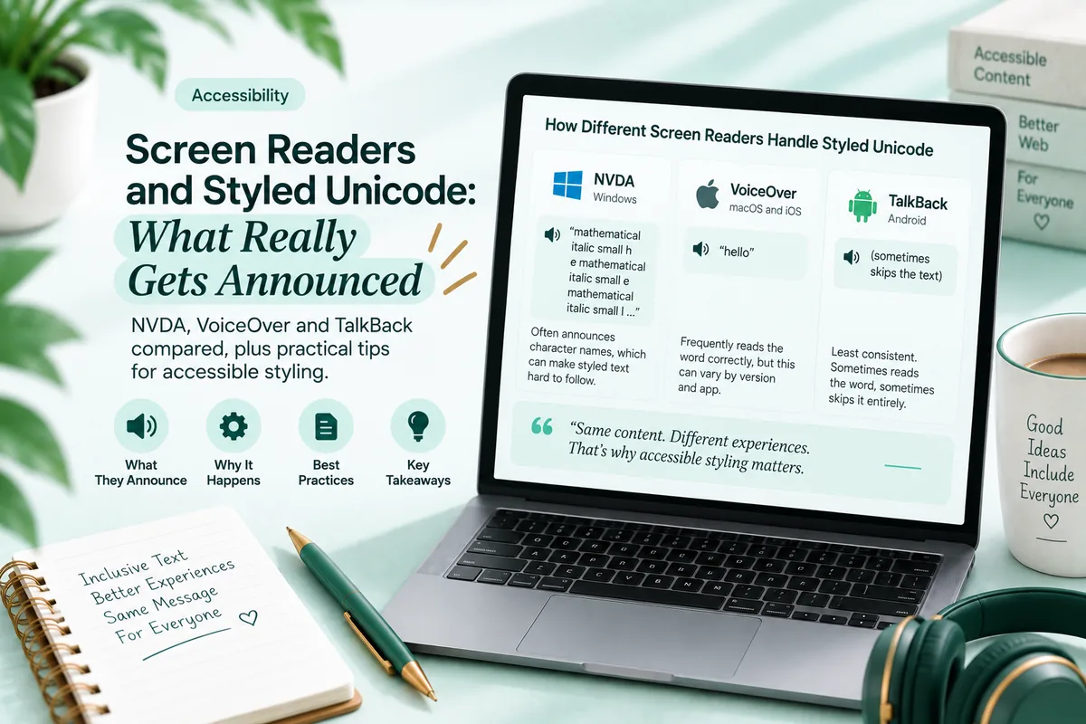
Android is where most reports of boxes come from, and not because Android is worse in general. Recent builds include the Noto symbol fonts and render the mathematical range fine. The problem is the long tail: older devices, heavily customised manufacturer builds, and budget handsets that ship a reduced font set to save space.
That long tail is a large share of the audience on TikTok, WhatsApp and Instagram, which is why converted text fails more visibly there than on a desktop first platform.
Which styles are safest
Coverage follows age and mathematical usefulness, not aesthetics.
Broadest coverage: bold, italic, sans serif and monospace. These are the oldest alphabets in the Mathematical Alphanumeric Symbols block and the most used in real mathematics, so symbol fonts prioritise them.
Nearly as safe: double struck and fraktur. Both are standard mathematical notation and are usually present wherever the block is supported at all.
Riskiest: circled and squared letters. These do not live in the mathematical block at all. They come from Enclosed Alphanumerics and its supplement, which many symbol fonts skip entirely because they are decorative rather than mathematical. The block boundaries are covered in the Mathematical Alphanumeric Symbols explainer.
Script sits in an awkward middle position. Coverage is generally fine, but script is also the style with eleven missing letters, so a badly built converter produces blanks that have nothing to do with fonts.
Two different boxes that look identical
This distinction is worth internalising, because it changes what you can do about the problem.
A missing font. The character is valid and assigned. The reading device simply has no font containing it. It renders correctly on other devices, and there is nothing you can do from your side except choose better covered styles.
An unassigned code point. The converter emitted a slot Unicode never assigned, usually by applying arithmetic across one of the twenty four exceptions. There is nothing to draw anywhere, so it is blank on every device in the world.
Both show the same empty rectangle. The way to tell them apart is to check your own output on a second device: if it renders somewhere, it is a font problem; if it is blank everywhere, the text was generated badly. Why some italic letters are missing covers the second case.
What you can do about it
Technically, nothing. You cannot embed a font in a social media caption. The platform decides how your text is drawn, and the reader’s device decides which font that means.
What you can control is the input, and four habits make a real difference.
Choose from the well covered ranges. Italic, bold, sans serif and monospace fail least often.
Keep styled runs short. A single missing glyph inside a two word phrase is survivable. The same glyph inside a fully styled paragraph destroys the sentence.
Never put load bearing information in styled characters only. If the date, the price or the address exists only in converted form, a font gap means that information is gone rather than merely ugly.
Check on a second device before it goes out. Ideally an Android one, since that is where coverage varies most. This takes thirty seconds and catches nearly everything.
Apps, browsers and the fonts a developer controls
The same device can render the same characters two different ways depending on what is displaying them, which surprises people who assume the phone has one answer.
A native app declares its own font stack. A web page declares another, in CSS, and the browser walks that list before falling back to system fonts. So a styled phrase can render one way in the Instagram app and another way in Instagram on the web, on the same handset.
If you build web pages, this is the one place where you do have control. A CSS font stack that ends with a font known to cover the mathematical range gives you a predictable result for visitors who have that font, and web fonts can be loaded for those who do not. That is why styled characters on a well built website look more consistent than the same characters in a social caption.
You get none of that in a caption. The platform owns the font stack, and it optimises for loading speed and its own brand rather than for symbol coverage.
Two practical consequences. First, checking your styled text on a website is not a valid test of how it will look in an app, so test where you are actually publishing. Second, if you are choosing between putting a styled phrase on your own site or in a social bio, your own site is the place where you can make it reliable.
The tofu box
The empty rectangle has a name. It is called tofu, because it looks like a block of it, and the Noto font family is named for the goal of having “no tofu” anywhere.
It means the device found no font with that character. It is not corruption, it is not a virus, it is not your mistake, and it is not something the reader can fix by updating an app. It is a device honestly reporting that it cannot draw what it was sent.
Understanding that changes how you respond to it. Nobody has broken anything. The text simply asked for something that device does not have.
Screenshots freeze the problem
One consequence that catches people out: a screenshot renders text with the fonts of the device that took it, and then it is an image forever.
That is occasionally useful. If you need a styled phrase to look exactly one way for everyone, screenshotting it on a device with good coverage and posting the image guarantees the appearance. Text in an image cannot be searched, copied or read by a screen reader, so it is a bad default, but for a purely decorative graphic it is a legitimate option.
It also explains a confusing pattern. Someone screenshots your post on a phone with boxes and sends it to you, and the boxes are now permanent in that image even though your post is fine. The text was never broken. Their device could not draw it at the moment the picture was taken.
Try it across devices
- Convert the same short phrase into five styles: italic, bold, monospace, cursive script and circled.
- Post all five somewhere private, or send them to yourself in a chat.
- Open the message on every device you have access to, including the oldest one.
- Note which styles fail on which device.
- Ask one friend on an older Android phone to send a screenshot.
You will end up with a personal coverage map that is more useful than any general advice, because it reflects the devices your actual audience uses.
Troubleshooting
It looks fine on my phone and broken on theirs. Font fallback. Their device lacks the font, yours has it.
Every device shows the same blank letters. Not a font problem. The converter emitted unassigned code points.
Circled letters fail almost everywhere. Expected. They come from a decorative block many symbol fonts skip.
It renders in the app and breaks in a browser. Web pages and native apps use different font stacks on the same device.
It broke inside a code block. Monospace typefaces rarely include the mathematical range. That is by design, not a failure.
One letter is a different weight from the rest. A borrowed character from an older block, with slightly different metrics from its neighbours.
Questions people ask
Why does fancy text show as boxes? No installed font contains that character, so the device draws an empty rectangle instead.
Why does it look different on Android and iPhone? Each operating system falls back to a different symbol font for the same code points.
Which styles render most reliably? Bold, italic, sans serif and monospace. Circled and squared letters are the least reliable.
Can I force a font in a caption? No. The platform decides. You only control which characters you send.
Is a box always a broken character? No. It can be a missing font, which renders elsewhere, or an unassigned code point, which is blank everywhere.
What to remember
The same characters produce different pictures because different machines own different fonts, and you have no say in which one draws your text. Choose from the well covered families, keep the styled part short, never let a font gap take information with it, and test on the oldest device you can reach before publishing something you cannot edit.
You can compare how each style is built, and which ones rely on the riskier blocks, in the Italic Text Generator.