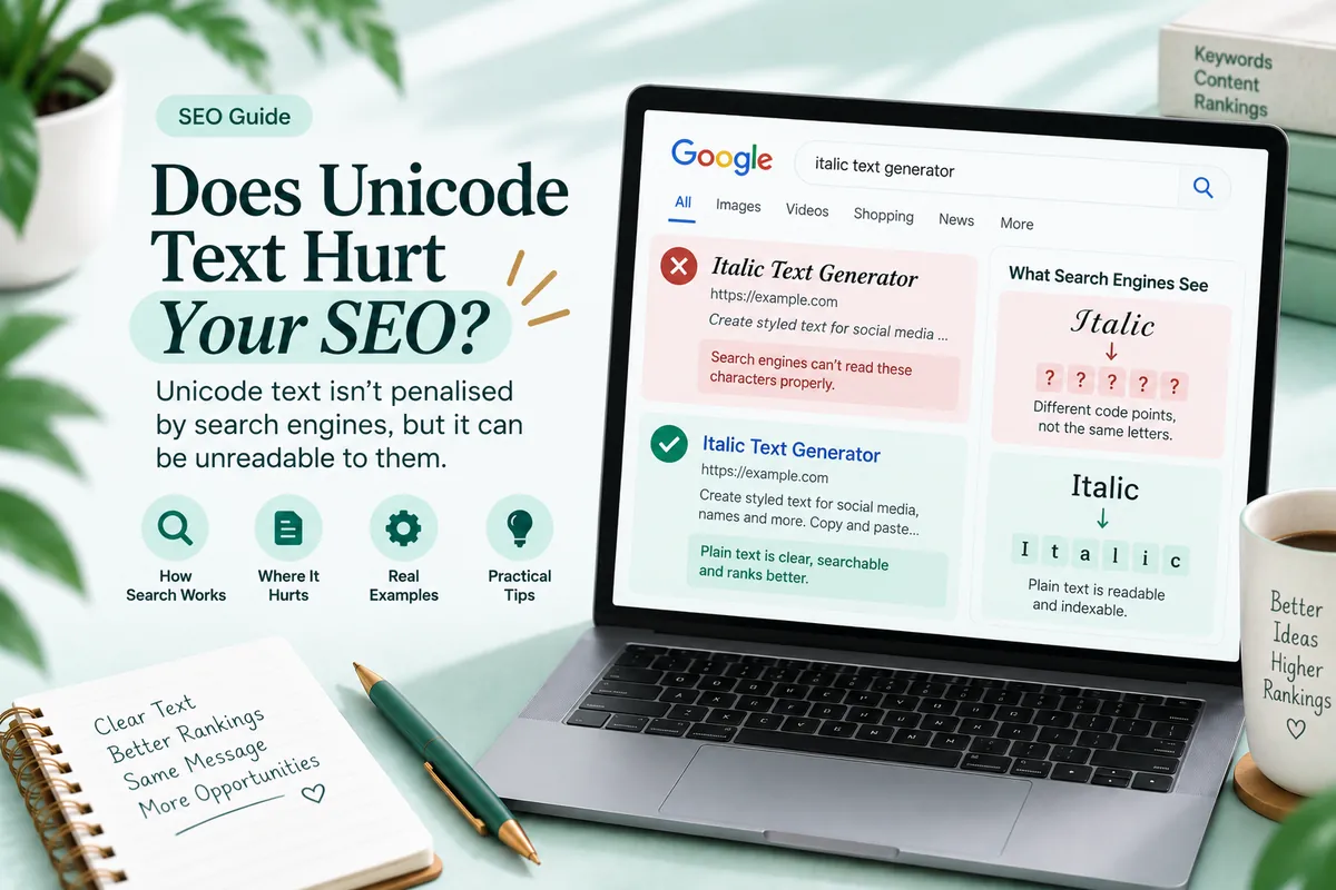
Every generator says styled Unicode is “not great for accessibility” and stops there. That is not enough information to make a decision with. Here is what actually happens when a screen reader meets mathematical italic text, so you can weigh it properly.
Short version: none of the three major readers treats these characters as ordinary text, and the most common failure is not a strange pronunciation. It is silence.
What the readers do
| Reader | Platform | Typical behaviour with converted text |
|---|---|---|
| NVDA | Windows | Often announces character names, so a word becomes a long run of “mathematical italic small” descriptions |
| VoiceOver | macOS and iOS | Frequently normalises and reads the word correctly, but this varies by version and by app |
| TalkBack | Android | Least consistent, sometimes reads the word, sometimes skips the run entirely |
Two things are worth drawing out of that table.
The behaviour is not fixed. It depends on the reader, its version, its verbosity setting, the application the text is in, and in some cases the speech synthesiser. The same bio can be announced three different ways on three devices.
And silence is common. A bio written entirely in cursive script can be completely absent to a listener. They do not hear a strange pronunciation and work out what happened. They hear nothing, and have no reason to think anything was there.
Why this happens
These characters are not letters as far as the operating system is concerned.
Unicode assigns every character a general category. Ordinary letters are categorised as letters. The mathematical alphanumeric characters carry properties marking them as mathematical symbols, because that is what they were encoded for. The block explainer covers why they exist and what they were meant to do.
Text to speech engines work from that classification. When a reader encounters a symbol it either announces the symbol’s name, hands it to a fallback rule, or drops it. All three of those are the engine working correctly. There is no bug to report and no setting a reader can change that makes converted text behave like prose.
Verbosity settings change the picture
A detail most guides miss: the same reader produces different results depending on how the listener has configured it.
Readers have punctuation and symbol verbosity levels. At a low setting, symbols are often skipped. At a high setting, they are announced by name. Someone who has turned symbol verbosity up to proofread code will hear your styled bio spelled out in full. Someone who has turned it down to listen comfortably will hear nothing at all.
You cannot know which setting your reader is using, which is the practical reason not to put load bearing information into converted characters. You are not choosing between two known outcomes. You are choosing not to control the outcome.
Native formatting is the accessible option
Wherever a platform offers real formatting, it is the better choice and it costs nothing.
Native bold and italic leave the underlying characters unchanged. The letters are still letters, so the reader receives the word and announces it. Whether the emphasis itself is announced depends on the platform and the reader, but the content always comes through.
This is why the accessibility advice and the search advice point the same way. On Telegram, WhatsApp, Reddit, Discord and YouTube, the native option is both more findable and more readable aloud. Converted characters are for the fields those platforms leave as plain strings.
Combining marks behave differently
Underline and strikethrough are worth separating out, because they are not substituted letters.
They are invisible marks stacked on top of ordinary characters. The letters underneath are unchanged, so a reader that ignores combining marks announces the plain word correctly. That makes them meaningfully more accessible than substitution, and it is one of the few cases where a decorative effect costs a listener nothing. The mechanism is covered in how underline and strikethrough actually work.
Some readers do announce combining marks, which produces a small amount of noise rather than a lost sentence. That is a much better failure mode.
The practical rule
Every sentence that carries meaning should exist in ordinary characters somewhere on the page.
Styled type is for the parts a sighted reader glances at: a name, a heading that is repeated in plain text nearby, a decorative flourish that adds tone rather than information.
That is not a compromise, and it produces better writing anyway, because a caption that depends on its typeface to work is usually a caption that is not saying enough.
Three fields are absolute rather than advisory:
- Alt text. It exists so an image can be described. Styling it removes the only description a blind user has.
- Link text. A converted link label tells a listener nothing about where the link goes, and readers commonly present links as a list out of context.
- Form labels and error messages. Styling these breaks the interface, not just the reading.
Emoji are not the same problem
A comparison worth making, because it clarifies where the real issue is.
Emoji are also non letter characters, and screen readers handle them well. They have descriptive names, readers announce those names, and listeners are used to hearing them. A caption with three emoji in it is perfectly usable.
The difference is that an emoji’s name describes the emoji, so the announcement carries the meaning. Announcing “mathematical italic small a” does not carry the meaning of the letter a, because the listener has to reassemble a word from a stream of descriptions.
That distinction points at the actual rule. The problem is not that the characters are unusual. It is that a run of them is meant to be read as a word and cannot be. One decorative character is fine. Thirty of them spelling out a sentence is not.
A test that takes thirty seconds
You do not need special software. Every device you own already has a screen reader installed.
- Turn on the reader: Narrator on Windows, VoiceOver on macOS or iOS, TalkBack on Android.
- Point it at your own profile or the page you are worried about.
- Listen to where your job title, your business name, or your main heading should be.
- If you hear nothing, or a stream of character names, you have your answer.
- Turn symbol verbosity up one level and listen again to hear the other failure mode.
Step five is the one that makes the variability real. Most people are surprised that the same text produces two completely different results on the same device.
What to do about text you have already published
Most people arrive at this topic after styling something, not before. The cleanup is short and worth doing in order.
Alt text first. It is the only field where converted characters remove information that has no other source on the page. It is also usually the fastest to fix, because alt text is short.
Then anything that identifies you. A name, a job title, a business name, a role. These are announced constantly and are the fields a listener most needs. A styled display name is announced on every post, every notification and every message, which turns a single decorative choice into a repeated obstacle.
Then long runs. A fully styled bio or caption is the case where a listener gets nothing at all. Rewriting it in ordinary characters and keeping one styled phrase preserves the look and removes the wall.
Leave short flourishes alone. A two word sign off next to plain text costs nothing and does not need fixing. The goal is not zero styled characters. The goal is that no meaning exists only in styled form.
One thing not to do: adding a plain duplicate of the styled text immediately after it. That is a common suggestion and it makes things worse, because a reader that does announce the styled version now reads everything twice. Pick one form per piece of information.
Where styled text is genuinely fine
Display names that sit above a plain handle. One word flourishes inside plain sentences. Section labels where the section content underneath is ordinary text. A sign off line that adds tone and no information.
Those uses cost nobody anything, because the meaning was never carried by the styled characters in the first place.
Troubleshooting
A listener said my bio was empty. The run was skipped. Rewrite the informative line in ordinary characters.
The reader spelled out every letter with a long name. Symbol verbosity is high. That is the listener’s setting, not something you can fix from your side except by not converting the text.
It reads correctly on my Mac and not on my colleague’s PC. Expected. VoiceOver normalises more often than NVDA does.
Native italic is not announced as emphasis. Many readers do not announce emphasis by default. The words still come through, which is the part that matters.
A styled name is announced on every notification. Names are read far more often than any other field. That is the strongest argument for keeping a display name short if it is styled at all.
Questions people ask
Can screen readers read styled Unicode? Not reliably as words. The characters are classified as symbols, so behaviour ranges from character names to silence.
Which reader handles it best? VoiceOver most often, but inconsistently across versions and apps. None of the three treats it as ordinary text.
Is a little bit of styling acceptable? Yes, if every meaningful sentence also exists in ordinary characters somewhere on the page.
Why is a styled bio sometimes read as nothing? Some readers drop characters they cannot classify. Silence is common and is the worst outcome.
Is native formatting better? Yes, everywhere it is offered, because the underlying letters stay letters.
The honest summary
Styled Unicode is decorative type, and decorative type has always come with the rule that meaning must live somewhere else. Use it for names and flourishes, use native formatting wherever a platform provides it, never put it in alt text or link labels, and run the thirty second test on your own profile before deciding you are the exception.
You can see exactly which characters a converter produces, and which ones it patches by hand, in the Italic Text Generator.